
The Task:
Research, design, prototype, and test a reboot of an existing app.
I worked in a two person team for 5 weeks to answer the question “What should The New York Times look like 5 years from now?”
Project in collaboration with Marina Semez; my individual role was competitor research, surveys, sketch prototyping, and final animations.

Current App (paid):


Current App (free):


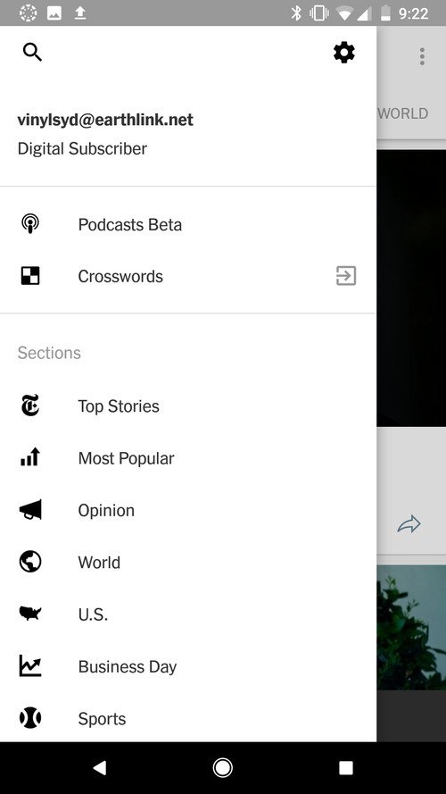
Initial feedback on the current app design: it’s nice to see the daily brief and the hierarchy of articles is pleasing, but there’s over 30 topics and the menu organization is overwhelming and doesn’t seem to have any organization. The paywall allows you to see article titles, but not read them. Articles become greyed out after you read them.
who’s our user?
“Millennials are now the single largest demographic segment of audience on the New York Times (all traffic), and that is incredible. This youthful interest – which accounts for “between 35-40% of the total audience” – has been “particularly striking” around the election of the new president, she says. The challenge now for the Times is to convert more of these young readers into paying customers.”
- Meredith Kopit Levien, the New York Times's chief revenue officer.

Research:

With some beginning research, we begin to identify issues - there’s not as much engagement as one would hope, and while it’s easy to navigate the app, people tend to run into issues trying to use the menu system. With 34 different categories and readers that are typically on the go while using the app, it can be time consuming and overwhelming to try and sort through the stories on the existing app.
Competitor Research:

Comparing the NYT to other similar apps reveals that one of its strongest pulls is its reputation; people trust them.

Survey:
After conducting initial interviews, we knew we needed to craft a survey to help us have more objective facts to work for when identifying the best ways to approach improving the app. We started with the question: “How do you want to get your news?” 44 responses later, here were the biggest takeaways:
68% feel they should be more up to date and informed on the news.
They felt their news was reputable only 23% of the time.
70% say that the credibility of journalists and an un-biased tone are the most important things they want from their news app.
Only 6% always finish reading the entire article they click on.


New mission statement:
The New York Times is a high-quality news source, dedicated to bringing news to people who want to stay up to date in this age of fast-moving information. With so many articles and sources to sift through online, The Times is condensing top stories into an accessible selection; whether you have a 30 minute commute, or a 30 minute lunch, the NYT Brief will ensure that you are informed.
OUR solution:

Free:
Only 50% of our surveyors read the NYT, and a paywall was a limiting factor. We aimed to close that gap by offering a free app with less information, that makes it simple and easy to subscribe for the full experience.
Condensed:
We’re in the age of information, and it can be daunting to have to read through multiple articles a day to feel up to date. Providing our audience with a breadth of news topics that are succinct but knowledgable increases confidence and help them feel more informed.
Reputable:
It shouldn’t take much effort for our audience to find reputable, reliable news sources. Our team of journalists and investigators are world-renowned. It’s time to make our stories more accessible.
Exploratory:
Checking the news doesn’t have to be bland. We want to highlight the NYT investigative spirit by providing alternate ways to check the news.
Prototypes:


homepage:


We reimagined the homepage as a place of 10 of the most pressing and popular stories of the day. A younger userbase can navigate a simpler, more minimal layout primarily foucsed on visuals. Clicking on the image reveals 3-4 paragraphs from the original article that provide you with a summary of the story.
U.S./WORLD


U.S. and World have the same usability features in order to provide the user with some consistency, once again adopting a photo first approach. Users see the familiar 3-4 paragraphs which they can read through, and have the option to subscribe if they want to continue.
Media:


A media tab brings together the best visuals the Times has to offer. This features a daily photojournalism story, a video story, and a VR story. This successfully incorporates the variety of ways that NYT provides the news.